Websites
Websites designed and developed with a focus on usability and brand alignment. Each project integrates clean visual design with intuitive navigation and responsive layouts built to engage users and perform across devices.
Wax Shack
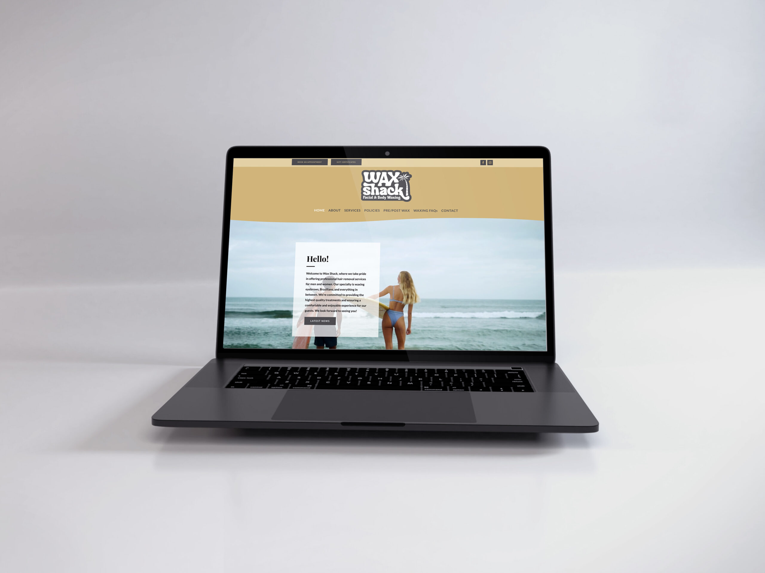
The Wax Shack website was designed with a focus on clean usability and a welcoming visual experience. A warm, modern color palette and bold, legible typography work together to reflect the brand’s approachable, professional personality. Careful photography selection enhances the aesthetic while showcasing services in a natural, inviting way. The layout was built with responsive design in mind, ensuring a seamless experience across desktop and mobile devices. Every element, from navigation to visual hierarchy, was thoughtfully crafted to guide users effortlessly through the site and encourage engagement.
GovCon Growth Solutions
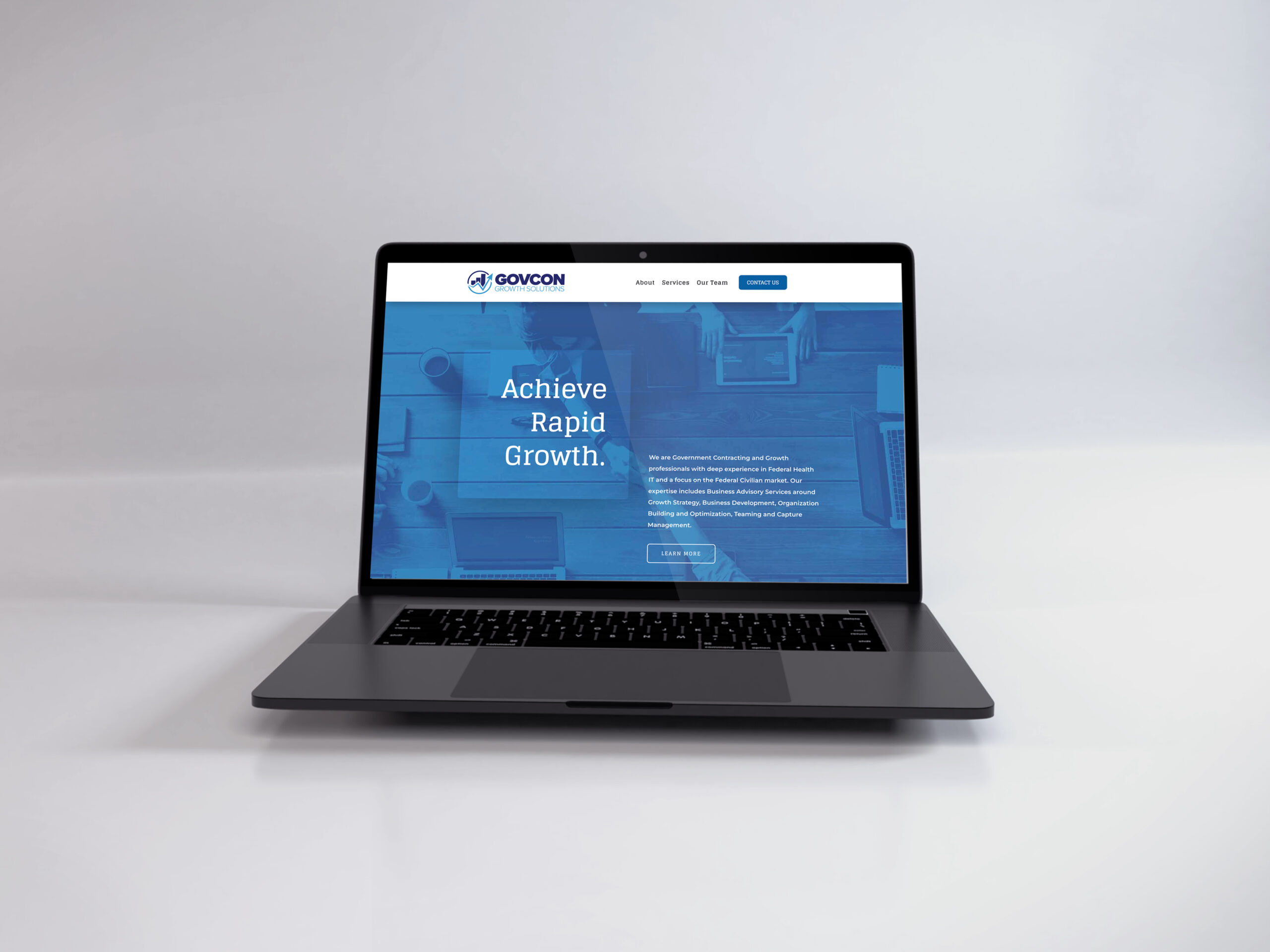
The GovCon Growth Solutions website was designed to convey credibility, clarity, and professionalism for a government contracting consultancy. The design emphasizes usability, with a streamlined layout and intuitive navigation that guides users to key service areas. A refined color palette and strong typographic hierarchy reinforce the brand’s authoritative tone, while selected photography, illustrations, and iconography support the content without distraction. Built with responsive design best practices, the site delivers a consistent, accessible experience across all devices.
Bishopville Barbershop
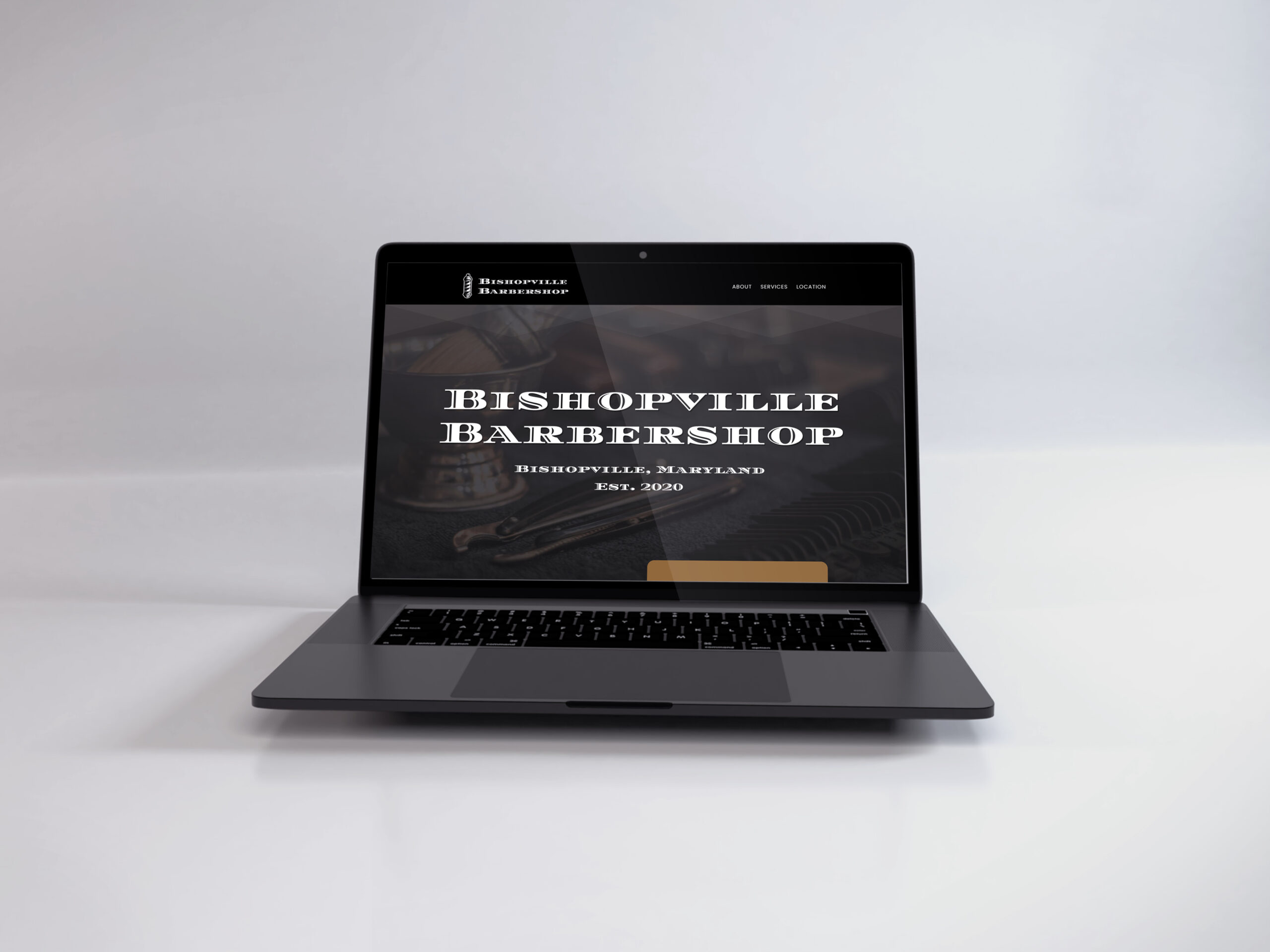
The Bishopville Barbershop website was designed to capture the charm and character of a classic small-town barbershop. Drawing inspiration from vintage signage and traditional barbershop aesthetics, the site features a timeless color palette, clean typography, and subtle textures that reinforce the nostalgic vibe. Usability was a top priority, with a straightforward layout and intuitive navigation that make it easy for customers to find key information. Carefully chosen photography adds authenticity and warmth, while responsive design ensures the site looks sharp on any device.
Strength Training DC
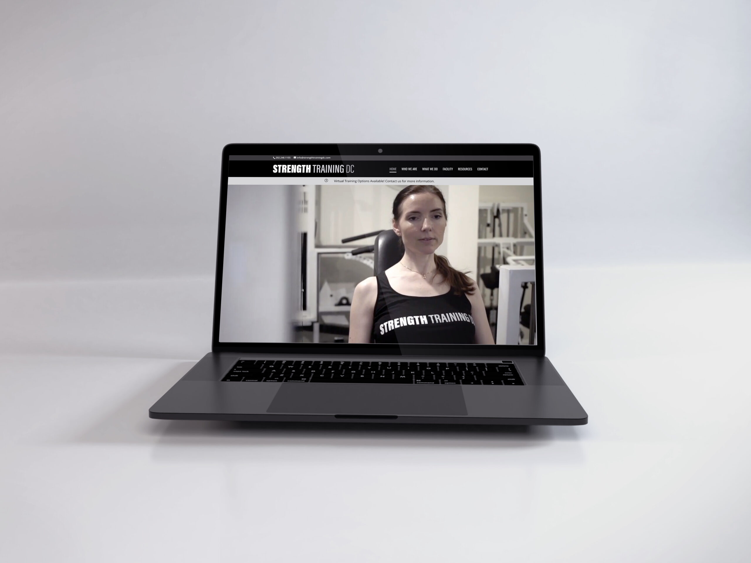
The Strength Training DC website was built to reflect the energy, focus, and professionalism of a high-performance personal training brand. Bold typography, an achromatic color palette, and confident layout choices support the brand’s no-nonsense, results-driven tone. Usability was key, with a clean, intuitive structure that allows users to quickly access services, credentials, and contact information. Custom-shot photography and strategically embedded video content bring the training experience to life, giving visitors an immediate sense of the coach’s style and approach. The site is fully responsive, ensuring a consistent, engaging experience across all screen sizes.


