Wax Shack
Overview
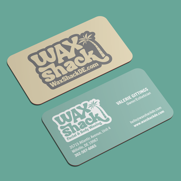
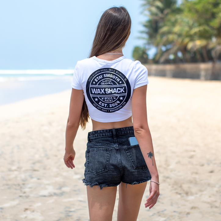
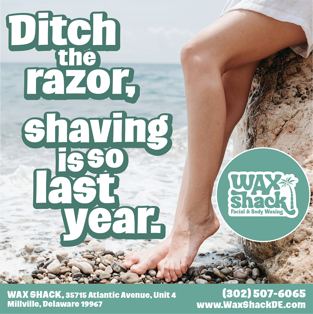
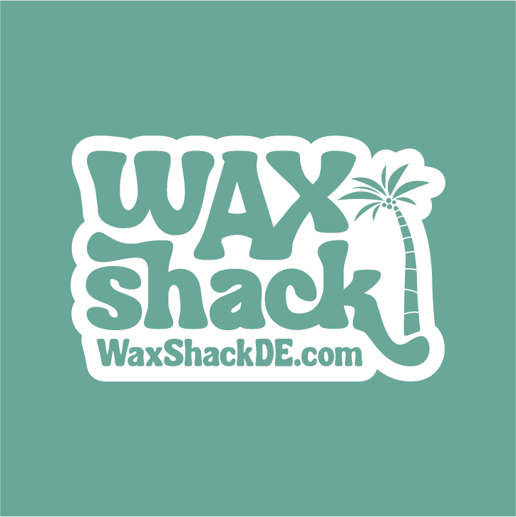
Wax Shack, a facial and body waxing studio located in the resort beach town of Millville, Delaware, required a logo and brand identity that struck a balance between casual fun and broad appeal. Specializing in hair removal services for both men and women, the goal was to create a logo that felt approachable, gender-neutral, and inviting to clients of all ages.

Services
- Logo
- Brand Identity
- Marketing and Promotional Items
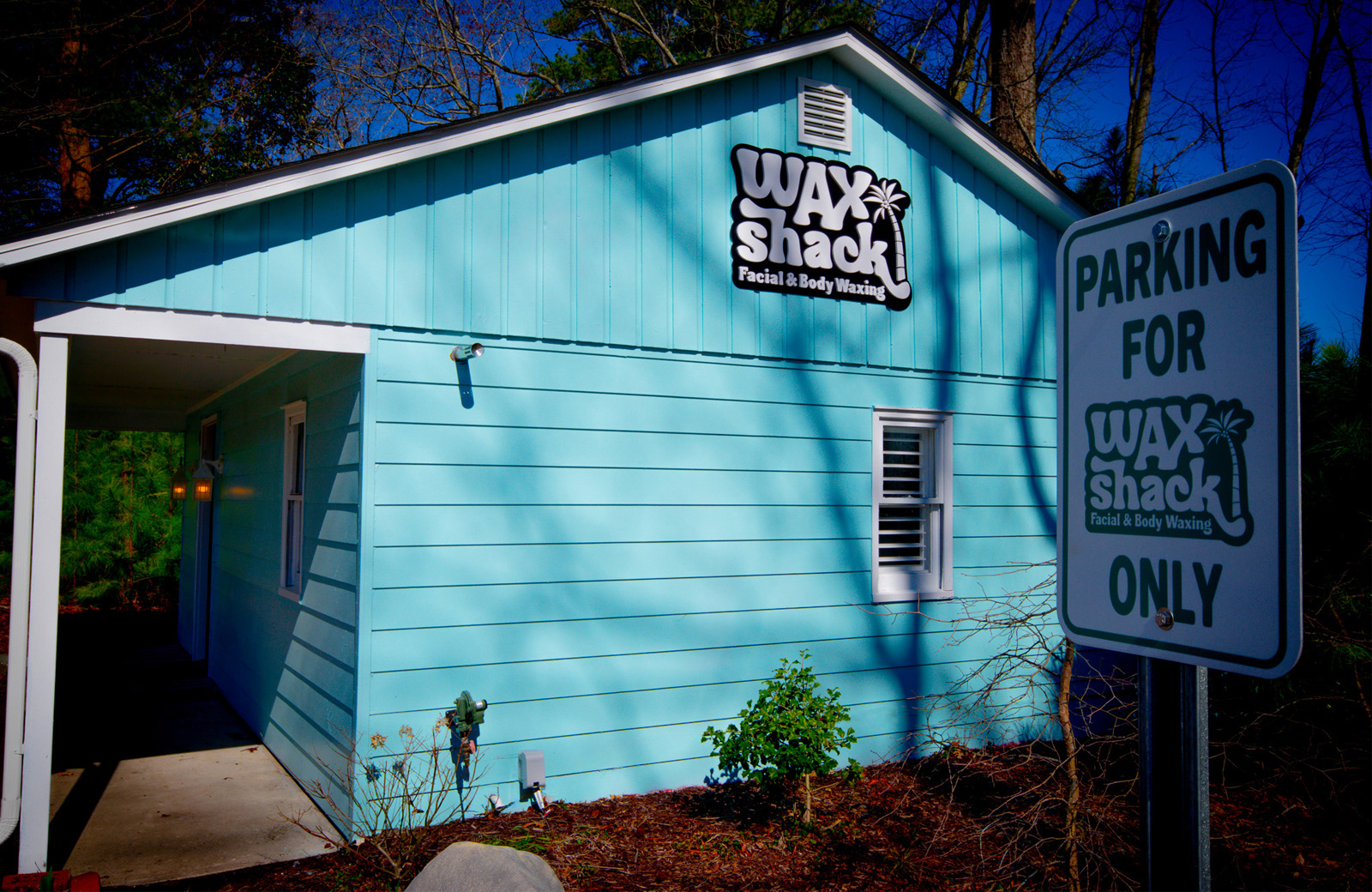
- Signage
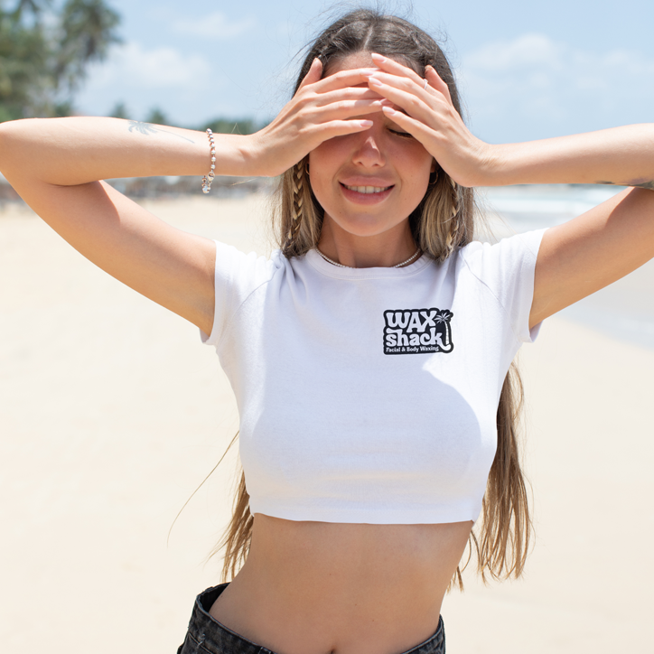
- Apparel
- Photography
- Social Media
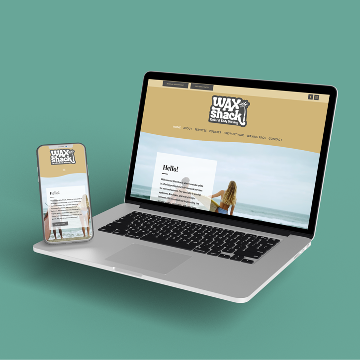
- Website
- SEO


Inspiration Behind the Design
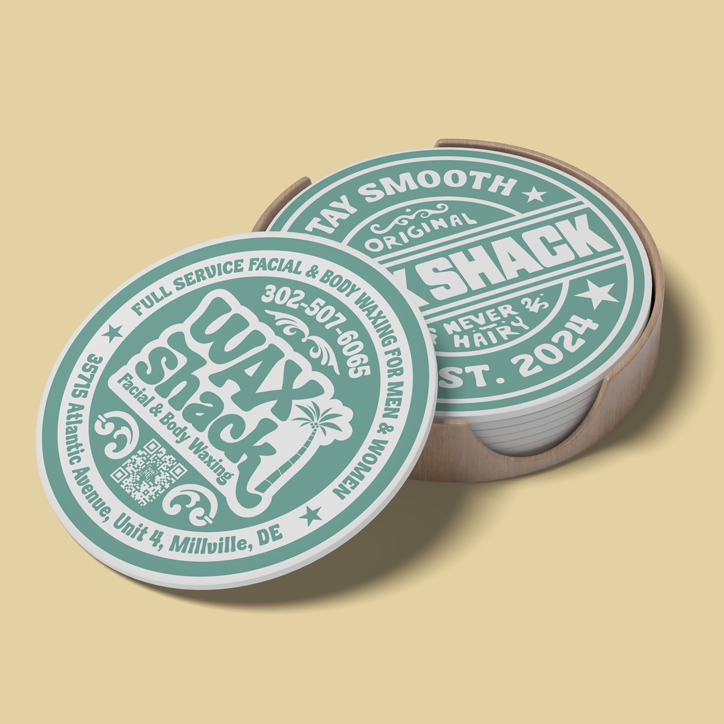
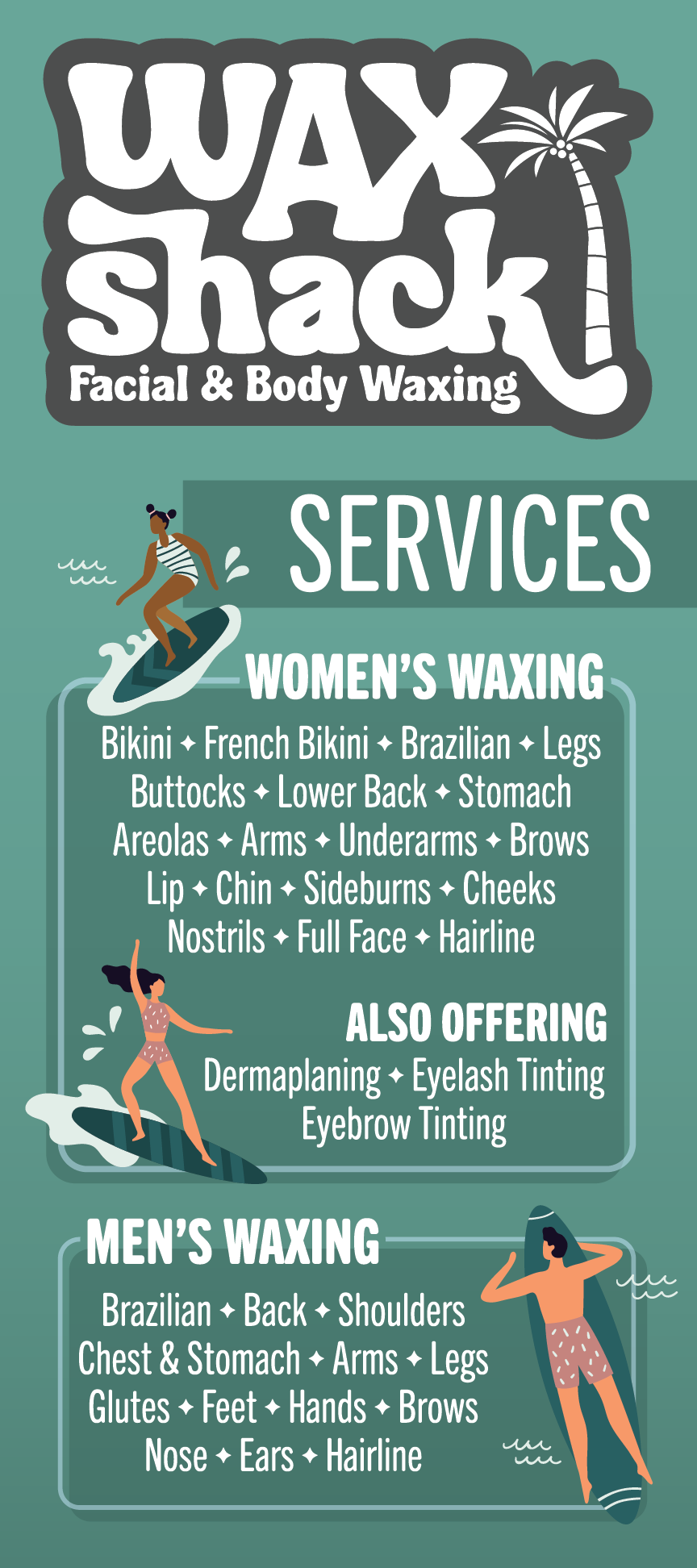
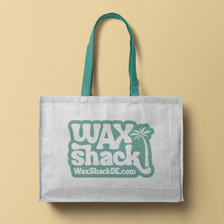
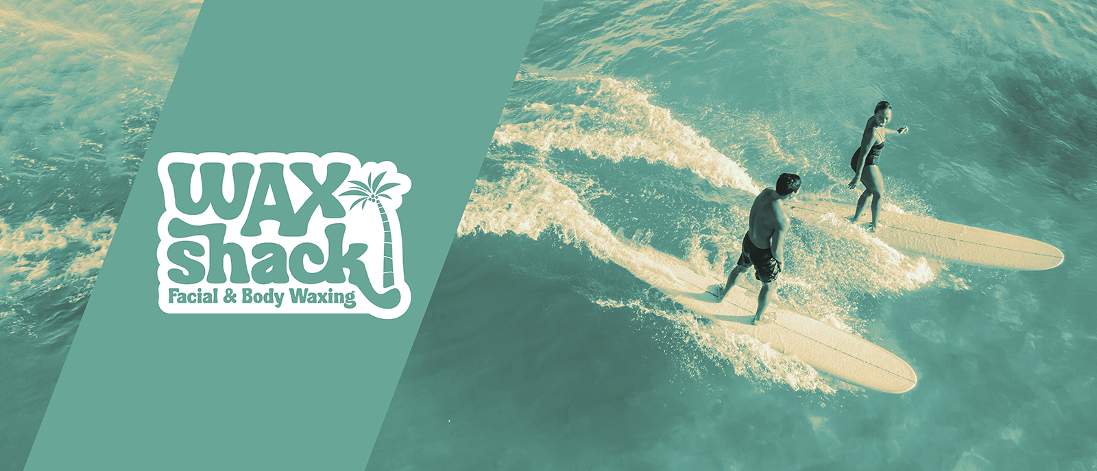
Drawing inspiration from the ocean and beach, the Wax Shack identity embodies the joys of surf culture, featuring sun-faded colors and hand-lettered type. The palette leans into summer with a salt-washed green and untouched sand tone, while shapes and patterns nod to island signage and board wax. The result is a mark that’s effortless and unmistakably fun, capturing the freedom, warmth, and salt-air vibe that sparked the design.
