GovCon growth Solutions
Overview
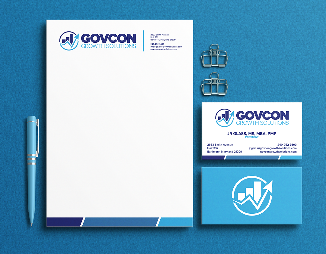
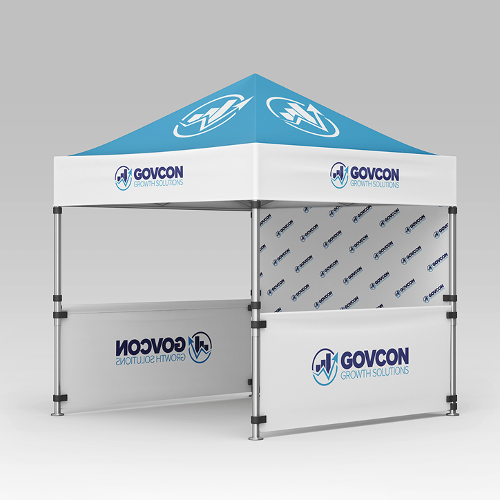
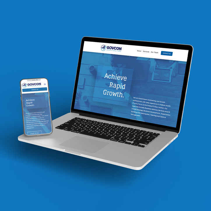
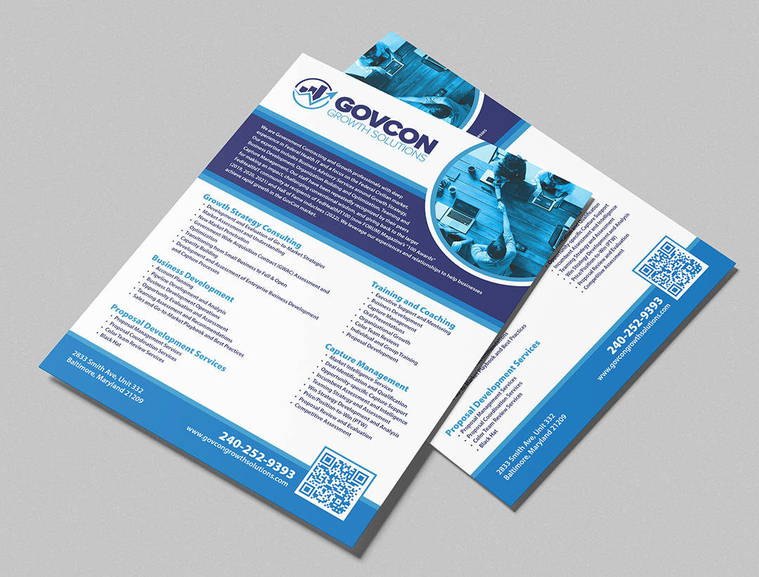
GovCon Growth Solutions, a team specializing in Federal Health IT and the Federal Civilian market, had a clear design goal: to create a logo and materials that convey growth, strength, and professionalism. Strong typography and a blue color palette were key elements in reinforcing their trusted reputation in the government contracting space.

Additional photos courtesy of Pexels.
Services
- Logo
- Marketing and Promotional Items
- Website
- SEO



Inspiration Behind the Design
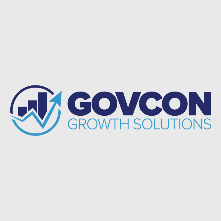
Built for the high-stakes pace of federal contracting, GovCon Growth Solutions uses a confident blue palette to signal trust, stability, and clear decision-making. The idea was to create a mark that visualized rapid growth. The upward arrow and bar-graph motif visualize momentum, rapid growth that’s measurable, as well as strategic and repeatable. Crisp lines, generous white space, and bold typography reinforce a no-nonsense, results-driven reputation, while graph bars cues nod to data. Altogether, the identity communicates credibility at a glance and a promise of acceleration from first conversation to contract award.


